Weddings: Rebecca and Shelby
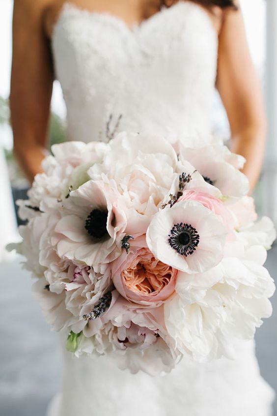
Rebecca and Shelby's wedding is set at a vineyard in Dahlonega, Georgia. When I met Rebecca, she had a clear idea of what she wanted in terms of her wedding day: Cabbage roses, a light pink/peach/greens/steel blue color palette, simplicity, and elegance. The venue itself is grand, rustic, with breathtaking views of the North Georgia Mountains.
As with any wedding projects, I started by building a mood board. I compiled photos that Rebecca sent to us, along with images on her Pinterest Wedding Board, and photos that I researched based on the information she shared.
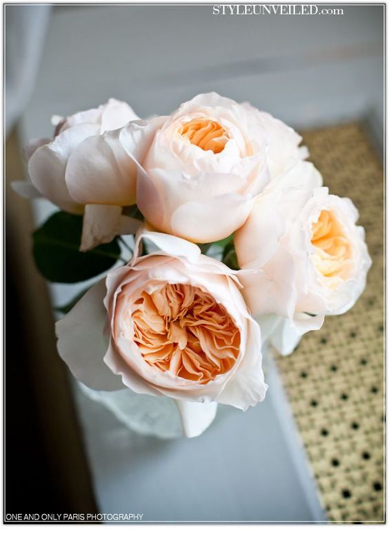

With this in mind, I started by painting a few vignettes of the details. Cabbage roses, succulents, Murphy (the most dapper puppy!), greenery, and the venue.
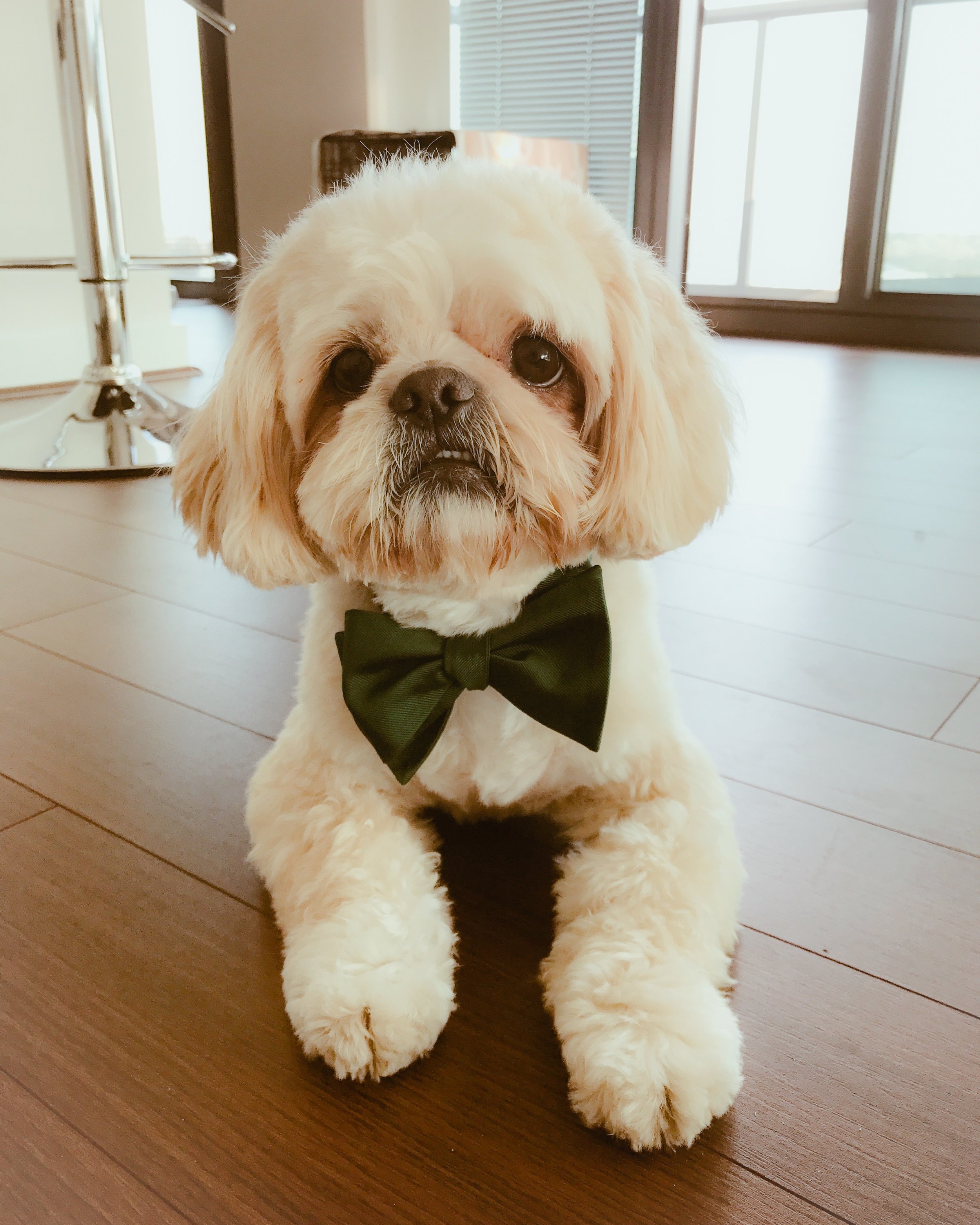
murphy in real life

murphy in watercolor
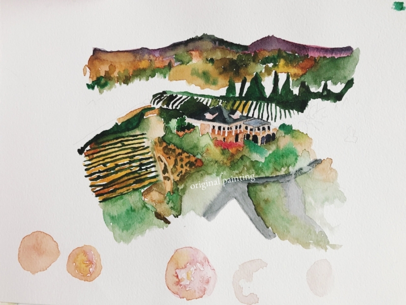
wolf mountain original painting
Venue painting of Wolf Mountain vineyard in Dahlonega, North Georgia. Rebecca wanted this print as gift to Shelby, and potentially as a part of the wedding suite itself. Bottom "blobs" are abstracts of my cabbage roses vignettes that I later used as a part of the invitation suite.
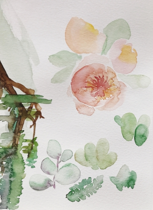
original watercolor vignettes of suite elements
Succulents and florals became a strong part of the suite. Later, these paintings are scanned and digitized to create different compositions.
When I design an invitation suite, I look at the project first from a 10,000 feet standpoint - what does the whole suite look like? Often times, when working with a color palette, all of the colors do not need to be thrown onto the actual invitations. I offer custom colored envelopes, so this is a way to create a suite that is simple, but captures a large part of the details.
The main challenge that I face when working with a client is the guesswork. Because all of our wedding invitations are bespoke/100% custom, I start every wedding project from scratch, and create different options of similar concepts. Depending on how much material I have to work with (more images and narratives = more options), I generate at least 2-3 options.

option 1

option 3

option 2

option 4
Rebecca chose option 2 - however she still somehow wanted to incorporate Murphy into the suite. So I came up with a custom mailing stamp and a print for the home.
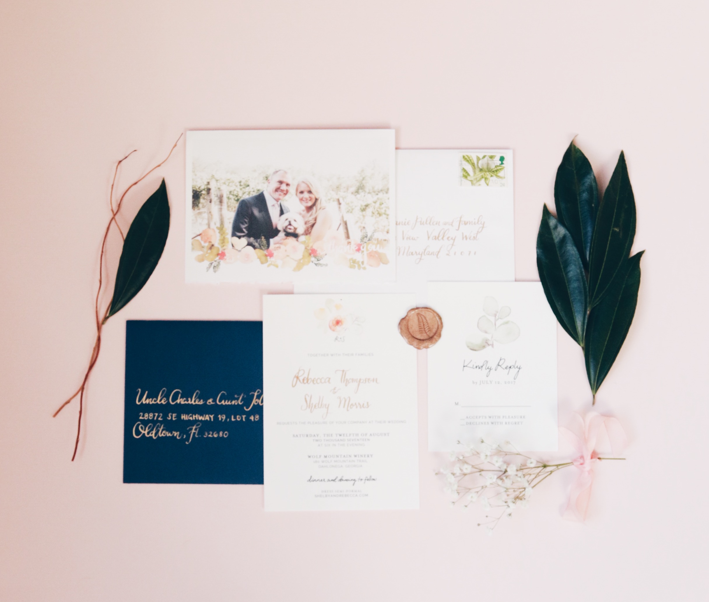
In terms of details, I used gold spot pointed pen calligraphy on the invitation. The copperplate gold ink that I use gives additional raised ink texture, and creates a more luxurious feel to the whole suite. I matched the gold ink on the invitation to the ink I used for addressing the invitation in a similar pointed pen style - simple, classic, and elegant.

the murphy stamp
Custom made, just for Rebecca & Shelby.

the raised ink effect
Spot pointed-pen calligraphy in copperplate gold. Paper is Crest Lettra, 300 GSM, in bright white.
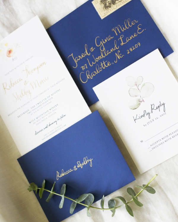
pointed pen calligraphy
In copperplate gold ink, against navy blue envelopes.
For the ceremony and post-wedding, I created custom welcome tags that match the wedding invitation suite, tied with hand-dyed silk ribbons. Post-wedding, Rebecca ordered custom thank you cards using their wedding photo, and I painted a border of florals that match the original invitation suite and the florals they actually used for the wedding.
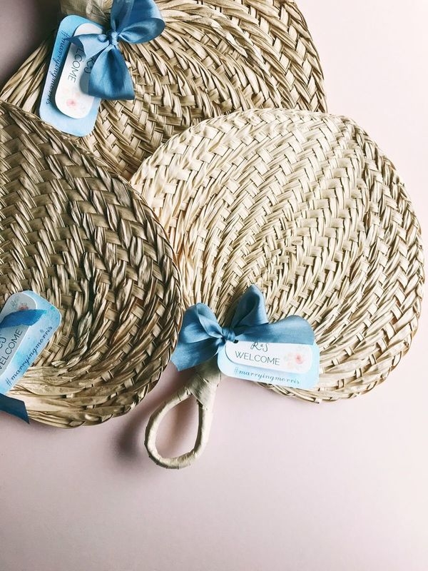
custom tags on ceremony fans
The blue bottom paper is Hanji (origin: Japan), that I custom-hand-dyed. The silk ribbons are from Anastasia Mika, and the "Welcome" tags are on the same Lettra paper that the invitations were printed. The R&S initial is the same as the R&S on their custom wax seal.
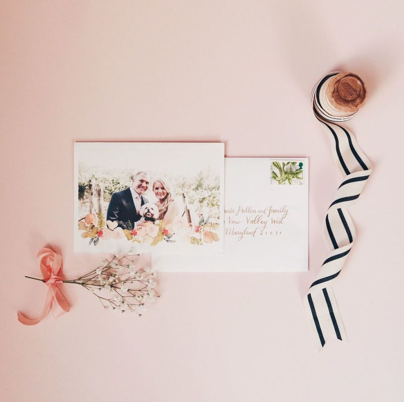
custom thank you cards
Using their wedding photo with a subtle bottom border of watercolor florals. Paper is deckled watercolor paper, to give texture.
I want to thank Rebecca and Shelby for allowing us to be a part of their special day, and I wish them a wonderful and happy life together!